
Cat Food Co.
January 2022
“Cat Food Co” is a cat food subscription service in the UK, offering a bespoke service customised exactly to your cat’s needs. Their USP is that they allow you to create separate profiles for each of your cats, allowing for health concerns, dietary requirements, tastes and allowing separate ordering schedules and delivery locations. Their target audience is cat owners with a specific interest in their cat’s health.


The problem: People on the beach are often hesitant to leave the beach and go to the cafe for snacks and beverages. They are often guarding belongings or looking after children or animals.
The goal:
To design an app that geolocates users on the beach and allows servers to bring their purchases to them.
My role:
UX Designer, producing the app from conception to delivery, including:
User research
Conducting interviews
Paper and digital wire-framing
Low and high fidelity prototyping
Conducting usability studies
Accounting for accessibility
Graphics and illustration
Iterating on designs

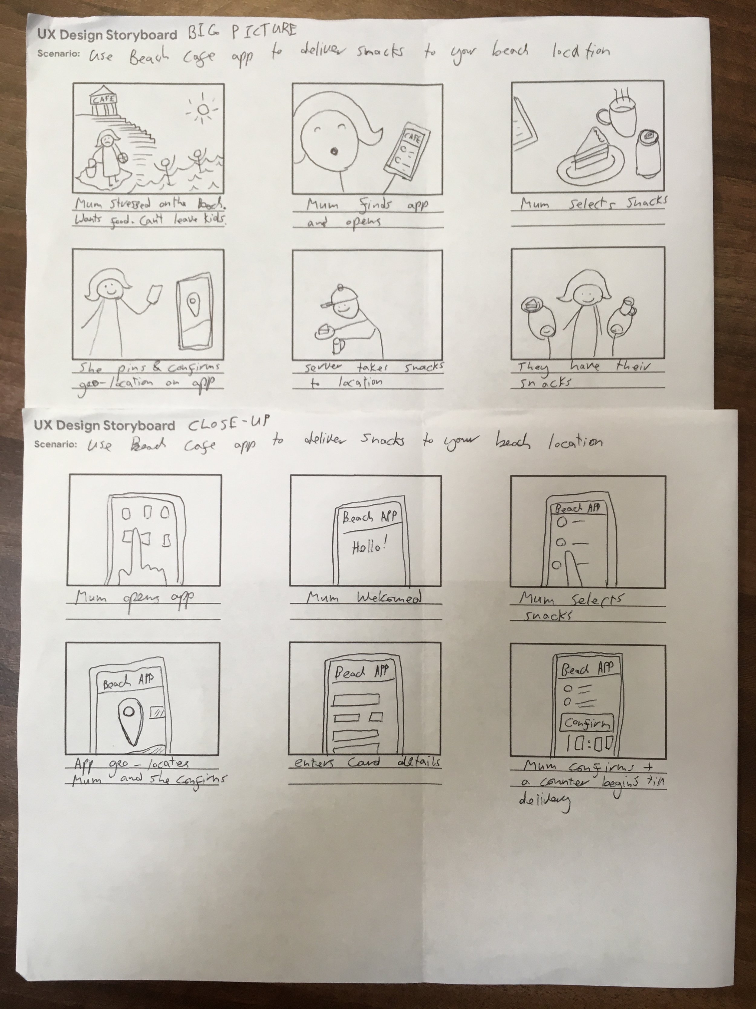
My UX research:
To understand the users I’m designing for, and their needs, I conducted interviews and created empathy maps.A primary user group I identified was mothers or fathers with young children, who go to the beach as the only adult.
This user group helped me to develop the idea for an app for a seaside setting where the servers would deliver to your beach location, meaning the user does not have to leave the young children alone, or drag them up to the cafe. I discovered that this feature was also very attractive to anyone who was worried about leaving their belongings unguarded on the beach, and in particular, to university students who often gather at the beach and would like to use the feature for ordering party drinks.
I interviewed users / made empathy maps and organised the research / created personas based on this / made scenario and close-up storyboards / and finally created wireframes.


-
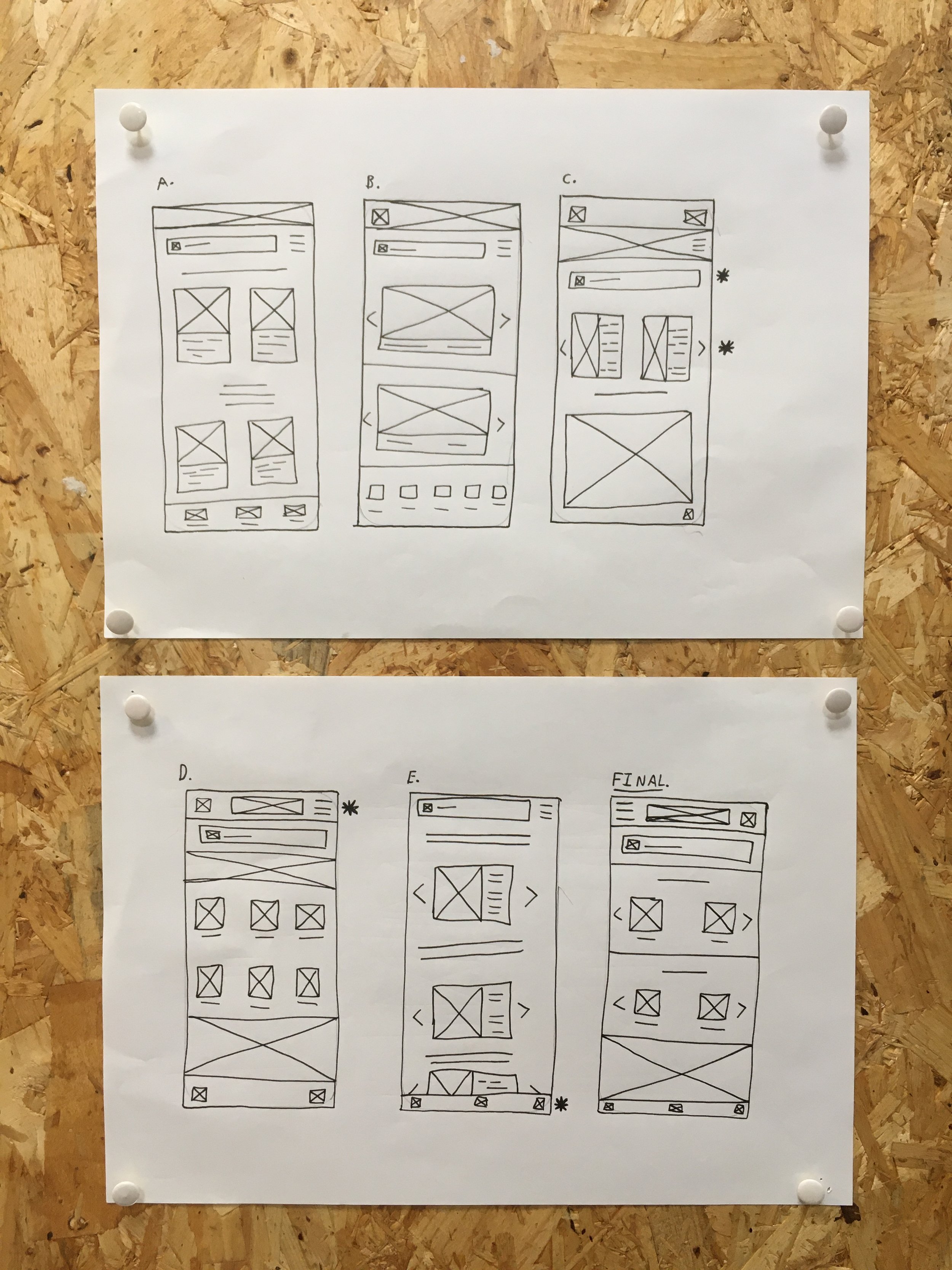
Wire-frames
In the original wire-frames I created simple interactions based on my user interviews and research.
I based this interaction on the storyboards I made from my “Personas.“

-
After Usability Study 1
After the first usability test I felt able to begin fleshing-out the design with colours, type-faces and icons.
The interaction here was fairly basic and users let me know that they wanted features added, such as an “added to cart“ confirmation pop-up, and alternative ways of paying, such as Paypal and Apple Pay.

-
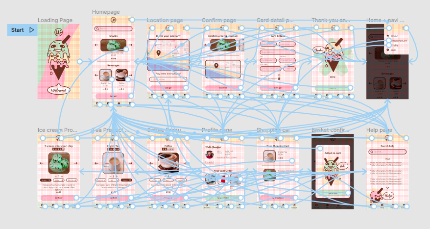
After Usability Study 2
After the second usability study I listened to feedback and adjusted the CTAs to be more accessible and added quantities for products.
I adjusted the “location” icon to be more accessible and illustrated ice-cream characters to make it happier and themed.
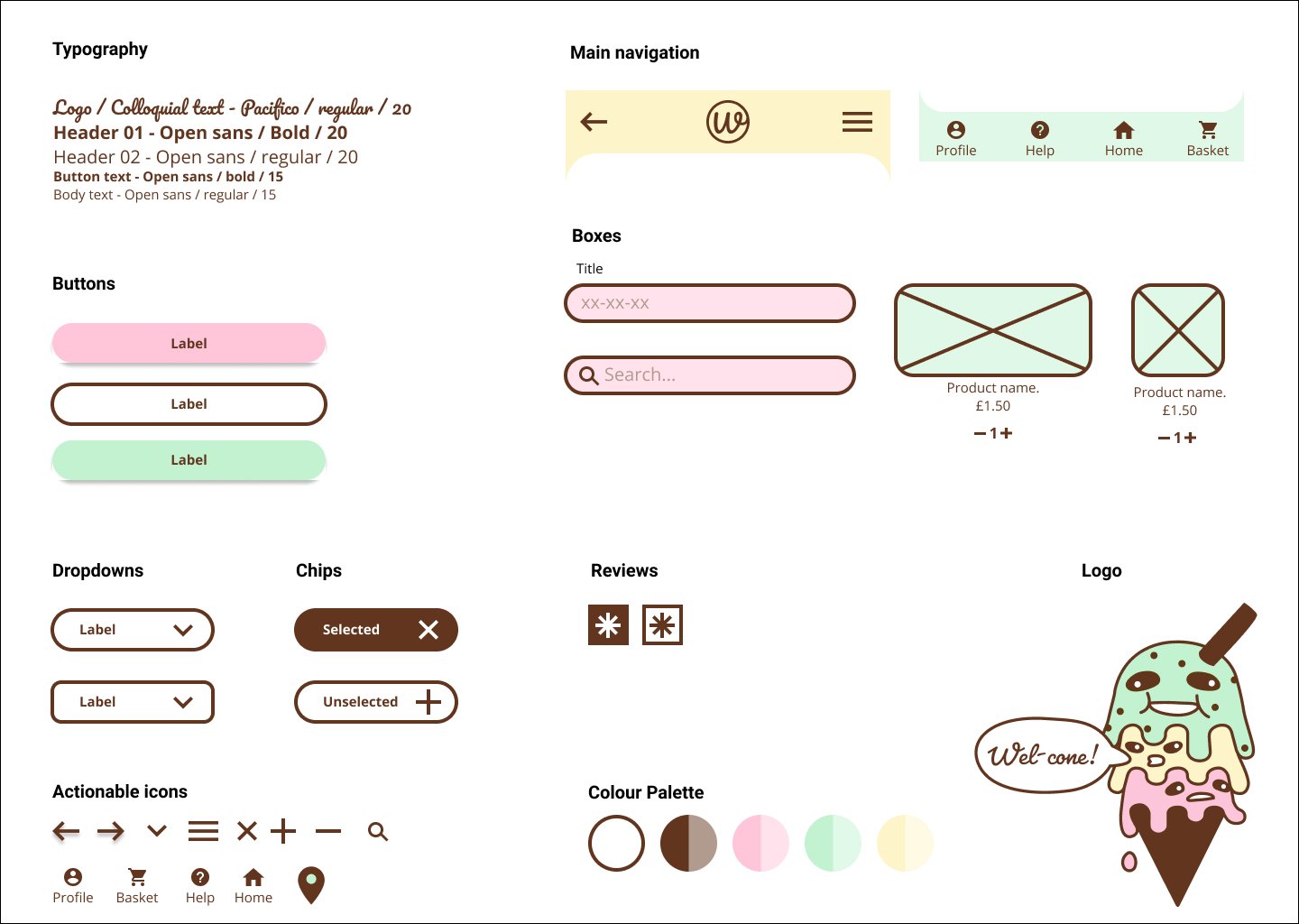
Sticker Sheet
Colours:
I wanted to reference the “Beachside snack“ theme with the colours, so I went for a classic pastel ice-cream palette. Instead of black, I used a dark chocolate brown, with strawberry pink as the accent and mint green and vanilla yellow paler colours to compliment.
Illustration:
I wanted a fun, casual, quirky feeling to the app, so I illustrated this ice-cream which utilises the full palette. The Mint on top is happy and appears to thank you for orders, whereas the strawberry is a little squashed and features on the “help“ page.
Thanks for looking!